


Super Superfamilies

It’s been a hot minute! But I bring goodies—
Super superfamilies.
More recommendations than gifts tbh (but if I could, you know I’d just buy fonts for all my friends readers).
First, what are superfamilies? A superfamily is the collective grouping of several explicitly related type families—such as a serif, sans, and slab—that all share the same underlying structure to their design.
It’s common for a typeface to be made up of several variants—typically weights: light, medium, bold, etc.—and this is referred to as a ‘family’. But when the variants are more, well, varied, i.e across genres (think serif and sans and mono and mix), that’s a ‘superfamily’.
Fun fact time: Thanks to cool type tech, superfamilies are sometimes just a single variable font file with sliders to make adjustments across genres.
Today, I present to you 3 of these soooper families. Starting with a long-time, personal fave →
💟 Arizona by Dinamo 💟
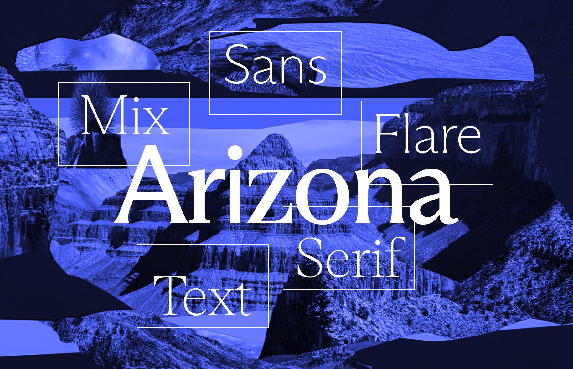
The “all-genres-in-one font happy-meal”
ABC Arizona packs 5 styles—Sans, Flare, Mix, Text and Serif in one elegant and seamless superfamily.
Arizona has had some fantastic uses over the years—a customised version for the very iconic SF Symphony branding by Collins, Glyphs App, and more recently, for Daylight.
And if I may, Arizona Flare has also been used on my website (no link included to minimise self-promo, but it might be snehasanks dot com). Fantastic or not? Well, that’s not for me to say 🙃
Check out Arizona by Dinamo Typefaces.
🆕 Season by Displaay 🆕
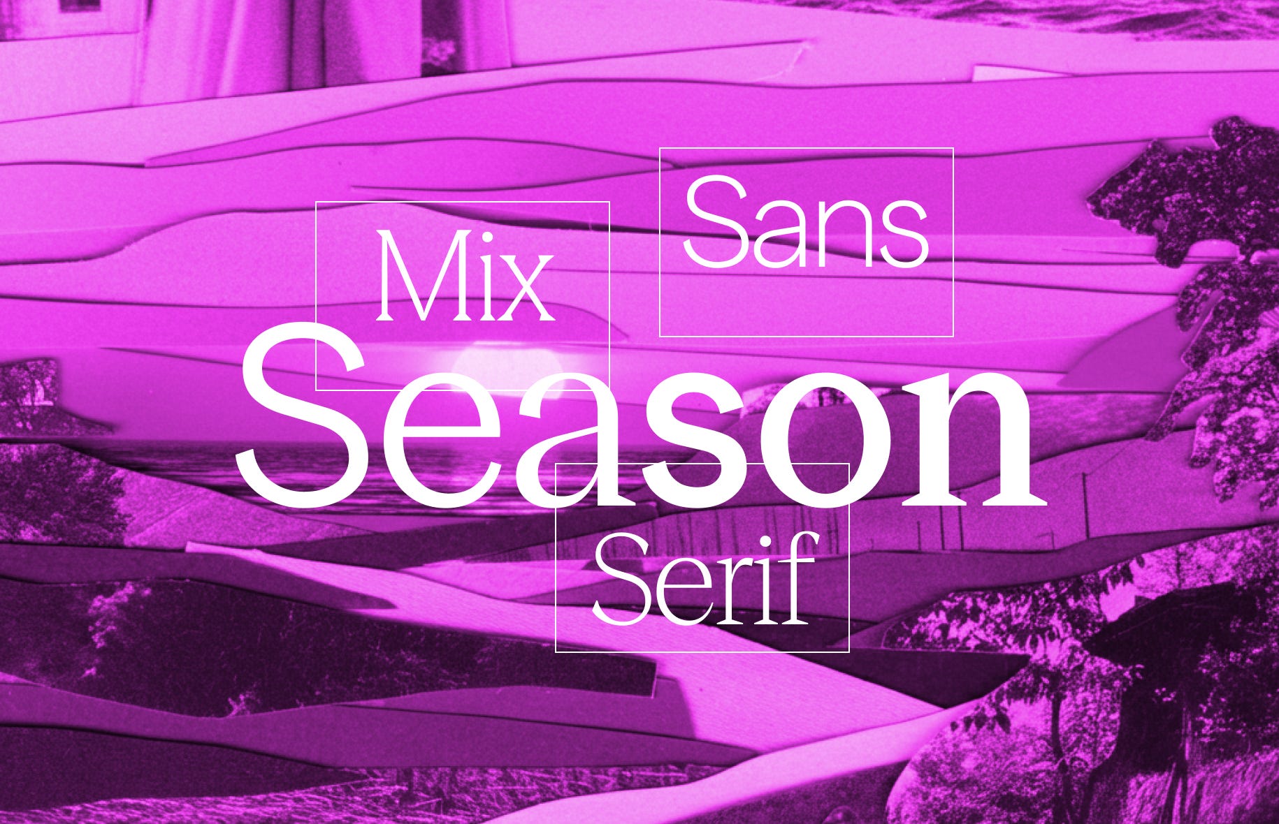
I know I write this newsletter, but sometimes the original authors write about their work better than I ever could. So, here’s how Season has been described by Displaay Type Foundry:
The exploration of the transformation from sans to serif (or serif to sans) and the stages in between is at the heart of our Season typeface. Just as you enjoy the changing seasons, we hope you’ll appreciate each phase of Season.
Check out the Season collection.
✅ Right by Pangram Pangram ✅

And lastly, this biggie: Right.
As per my in-depth, scientific research, it technically may not even be one superfamily ‘cos there’s literally 6 super-sub-families—Didone, Serif, Slab, Gothic, Grotesk and Sans—each with its own different widths, weights and styles. And there’s monospaces for some of these! Here’s Right Grotesk Mono and Right Serif Mono.
My favourite thing about Right is that it seems to have originated ‘ad lib-style’, starting with Right Grotesk. Subsequently, each of the sub-families got their designs with serifs cut off, contrast adjusted and thicknesses evened out.
The process of its creation makes this system so unique! I wonder if, Alex Slobzheninov, the designer of Right, made updates to already-released styles through his time working on their cousins and successors? Alex, if you’re reading this—big nerd here, we’re super curious!
And that was super superfamilies.
Next week, I’ll be frolicking the streets of Saigon, likely air-drawing the Vietnamese script on billboards and signage. So, I’ll be back the week after. As always, if you have any burning questions you’d like answered, shoot me an email or comment below, and I’ll get to it!
See you on the flippity-flip,
🌈 Sneha.