

T(EYE)POGRAPHY 👁
Yo! We have a theme again this week - eyes, sight, vision, seeing, you get the idea right? Let's get into it.

😍 Feast your eyes 😍
Google Fonts + 한국어 소개. Great typography makes the web more beautiful, fast, and open— but only if it’s available to everyone.
This year, Google Fonts unveiled an innovative new delivery system for Chinese, Japanese, and Korean (CJK) character sets. By scanning language patterns on the Korean web, machine learning and the latest web standards “slices and dices” incredibly large font files (the complexity of the Hangul script for example, requires thousands and thousands of glyphs) into smaller “byte-sized” chunks, delivering only what you need, when you need it.
The result? Faster loading pages, and a roadmap for expanded support in the near future and this gorgeous site with the most delicious interactions that showcases the open-source Korean fonts available.
👓 Time to get 'em eyes checked? 👓
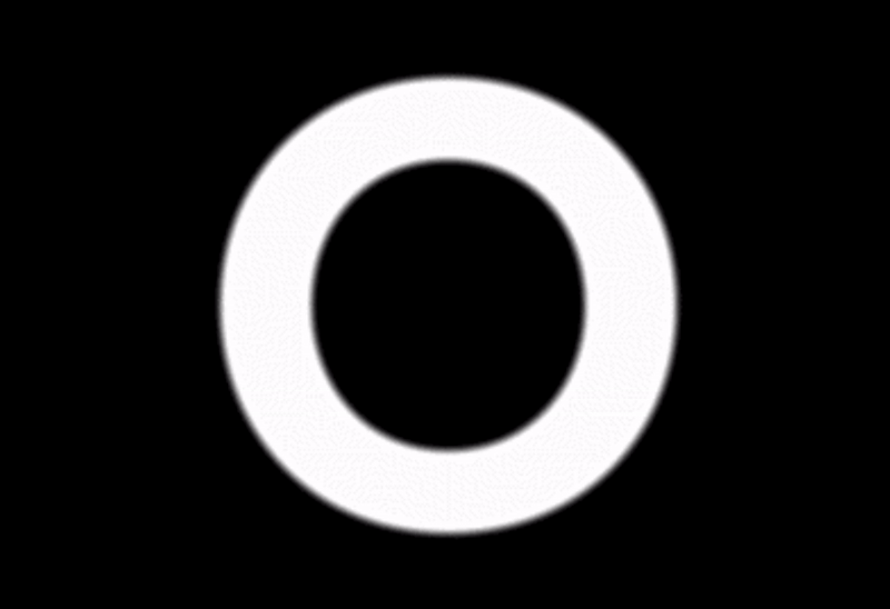
OPTICIAN SANS. A free font based on the historical eye charts and optotypes used by opticians world wide.
The LogMAR Chart is used by ophtalmologist, optometrists and vision scientist to estimate visual acuity. Optician Sans is based on the same visual principles as the LogMAR chart, adjusted to be used as a fully functional display typeface. Check out this video. A big shout-out to Abhishek Sharma for this resource! 😄

👁 Good typography is good for your eyes 👁
THE AESTHETICS OF READING. Typographers are attuned to subtle features when they design and set type. One such feature that is quite noticeable to the readers’ perceptual system is symmetry. It is a surprisingly difficult challenge to make and render symmetric type. For example, all the strokes across a font need to be of equal weight - if one vertical stem is heavier than the next then the relative darkness will appear as a dark spot on the page.
Kevin Larson, a psychologist and his team of typographers and computer engineers tested ways to reduce eye fatigue by designing fonts easier to read and explored ways to improve reader’s experience for people with visual impairments.
If you want to delve more into the relation between typography and psychology, please read . 'The Aesthetics of Reading'. To summarise, there's this.
💌 Upcoming in the next issues 💌
🙀 Why do SO many tech companies' logos look the EXACT same?
🥣 Cereal
🎰 New year. New free fonts!
Thanks again for subscribing and please feel free to hit reply with questions, suggestions or thoughts to any emails I send your way.
See yawl next week!
🌈 Sneha.