


The Issue with AI Issue

AI’s Kryptonite
Typography.
Not hands and feet today, I’m afraid.
Firstly, it’s been an amazing welcome back—I’ve received emails, comments, and messages about how excited many of you are to see ttt back in your inbox, and also about the topics you’re looking forward to diving into in upcoming issues—thank you all <3
Today, we talk about AI in the context of typography. Why doesn’t it yet get it? What are some experiments and developments happening in the world of AI x type? And finally, some links and tools to tinker with.
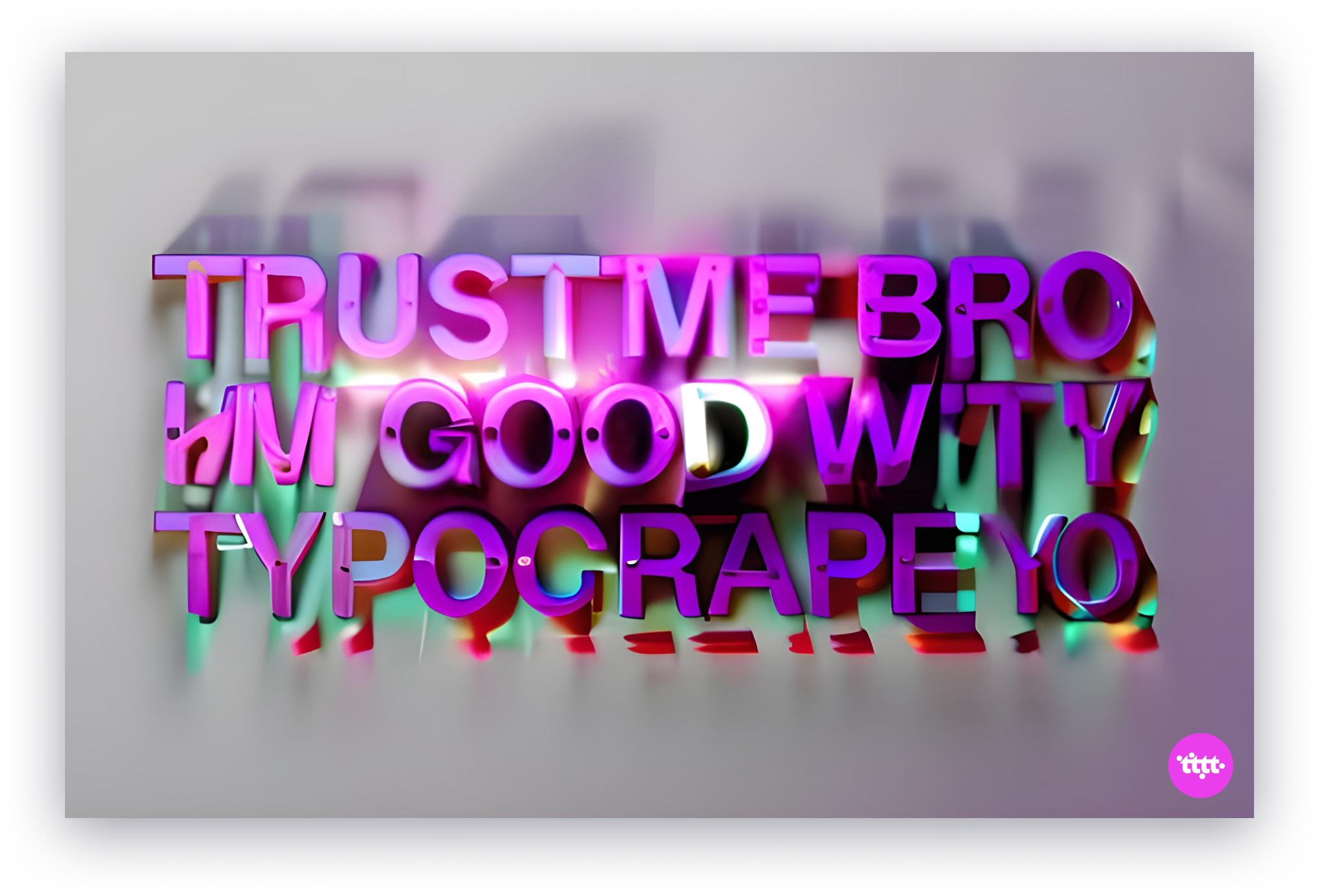
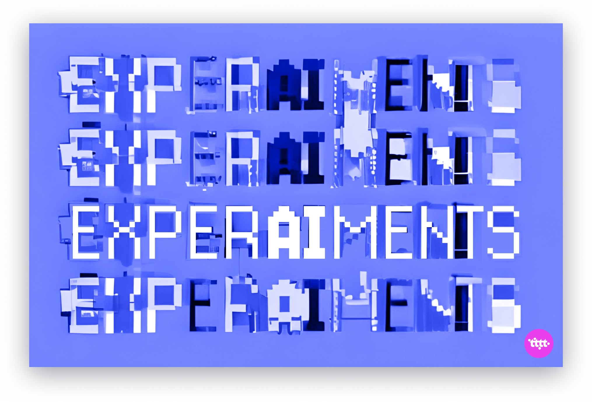
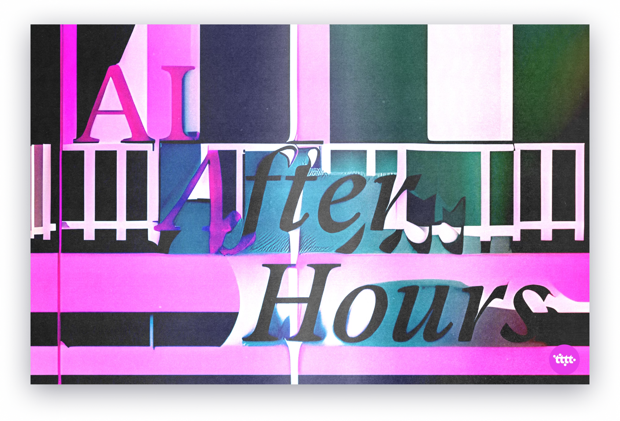
Warning: If you choose to read this issue aloud, it could resemble this.
Typo, No Type
Despite the buzz around AI’s potential in creative fields, its capabilities in typography remain limited.
There’s a few different reasons for this, but it’s largely because of the paradoxical nature of type design—everything is measured and systematic, yet instinctive and optical. As Craig Ward, a design director, says of typography in the article below, “Much of it doesn’t even make sense to those well versed in it.”
This WIRED article discusses why AI Isn’t Going to Reinvent the Alphabet Anytime Soon, how AI falls short as a creative tool because of its lack of understanding of the nuanced, systematic and human nature of type design and reading, and why it’s more likely to find success with technical tasks like spacing and kerning, at least in the near term. (never say never, yawl)
When AI met Typography
There are a ton of exciting experiments happening in the world of Type x AI, bits and prompts, if you may.
Here are some that caught my attention:
Dev Valladares’s illustrations and experiments for WIRED: 1 | 2
In fact, so many of Dev’s trials with AI and typography, some of which are showcased on his website, are incredibly exciting. OpenAI thought so too!
The ever-experimental Khyati Trehan does a lot of, what she calls “ping-ponging” with AI—going back and forth between her skills + conventional design tools and her eye + GenAI tools—almost like sparring with a creative partner. Here are some of my ping-pong favourites: 1 | 2 | 3
Font Map by Kevin Ho is an older project that also seems to be inactive now, but I liked the idea and its potential so much that I had to include it here. Read about his project and process here.
Artificial Typography is a beautiful book bringing together the alphabet and the history of art, imagined by AI.
Now, you try!
All this AI talk has likely gotten you fidgety to try your own hand at some of these tools.
So, here’s a list of fascinating tools, models and experiments to tinker with:
Over and above MidJourney and DALL-E, I’ve really enjoyed using Runway, Fable and Visual Electric. All very designer-friendly tools—I’ve found the most success (relatively) with typography on Runway, but I believe Fable gets some of it too.
DeepFloyd IF by Stable Diffusion can apparently integrate text into images! So, that’s good news.
In 2016, so way ahead of its time, Erik Bernhardsson tried to use AI to design a typeface. Not to much success in terms of usability, but did do it! He wrote about his process here, and has also the data to play around with.
That’s all this week, folks!
Next week, as per popular request, we’ll be deep-diving into the what/how/who/why of type design programs. If you have any burning questions you’d like answered, shoot me an email or comment below, and I’ll get to it!
See you Tuesday,
🌈 Sneha.
loved the visuals and that you covered how to whip them up in the last section!
Love the roundup! So many great leads to follow-up on. Thanks for sharing!