


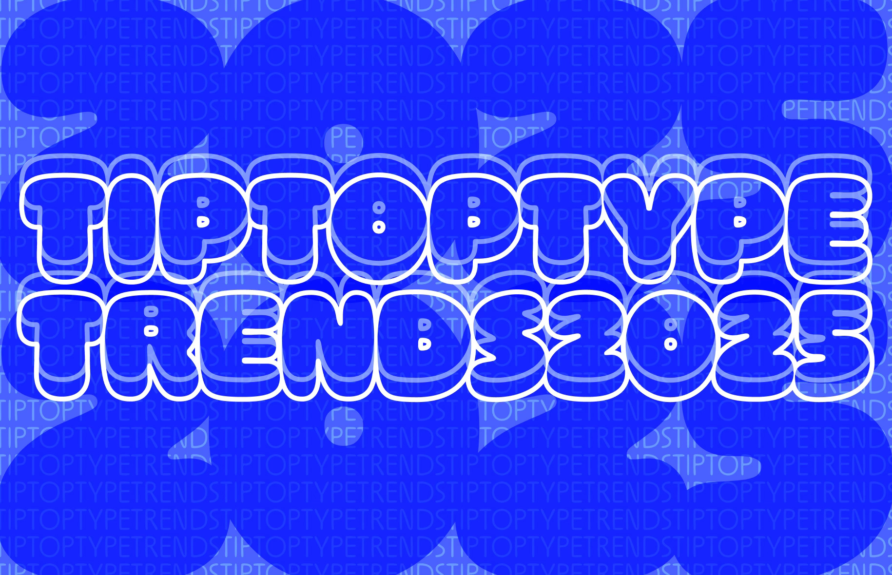
TIPTOPTYPETRENDS 2025

Let me start by saying that I’m a real skeptic (or dare I say, even a detractor) of trend lists, especially in design. They feel somewhat like a grand conspiracy. Like a group of important people in a secret room decided to push their agenda, and now everyone’s just along for the ride.
But trends don’t emerge in isolation. They’re always a reflection of our evolving world—the zeitgeist, the signs of the times: tech, culture, media, politics, and so on. Sometimes, they’re as simple as a reaction to the trends that came before.
Trends are a continuous cycle of innovation and emulation. They’re how people connect, mimic, and interact. We’re obsessed with trends because to follow one is to belong—you’re in the loop, part of a group. You fit in.
Often, trends boil down to people copying what works, what sells. It’s a shortcut to understanding what people want and delivering it.
So, in a way, this edition of tttt is me following a trend. A girl’s gotta pay her metaphoric bills (this newsletter is so free, lol) and give the people what they want!
For ttttrends 2025, the theme I’ve picked up on is ‘character’: The upcoming year, typography is going to be all about embracing individuality and one’s personality.
As they say, “One is random, two’s a coincidence, and three’s a trend.” For each trend, I’ll highlight three recent examples to back up my thesis and show how these ideas are taking shape in the design world. Along the way, I’ll also try to connect the dots between these trends and the zeitgeist, unpacking what’s driving them and why they resonate right now.
Let’s give this a shot—
TIPTOPTYPETRENDS 2025
The ‘in my humble opinion’ edition
🏄 Serif’s up! 🏄
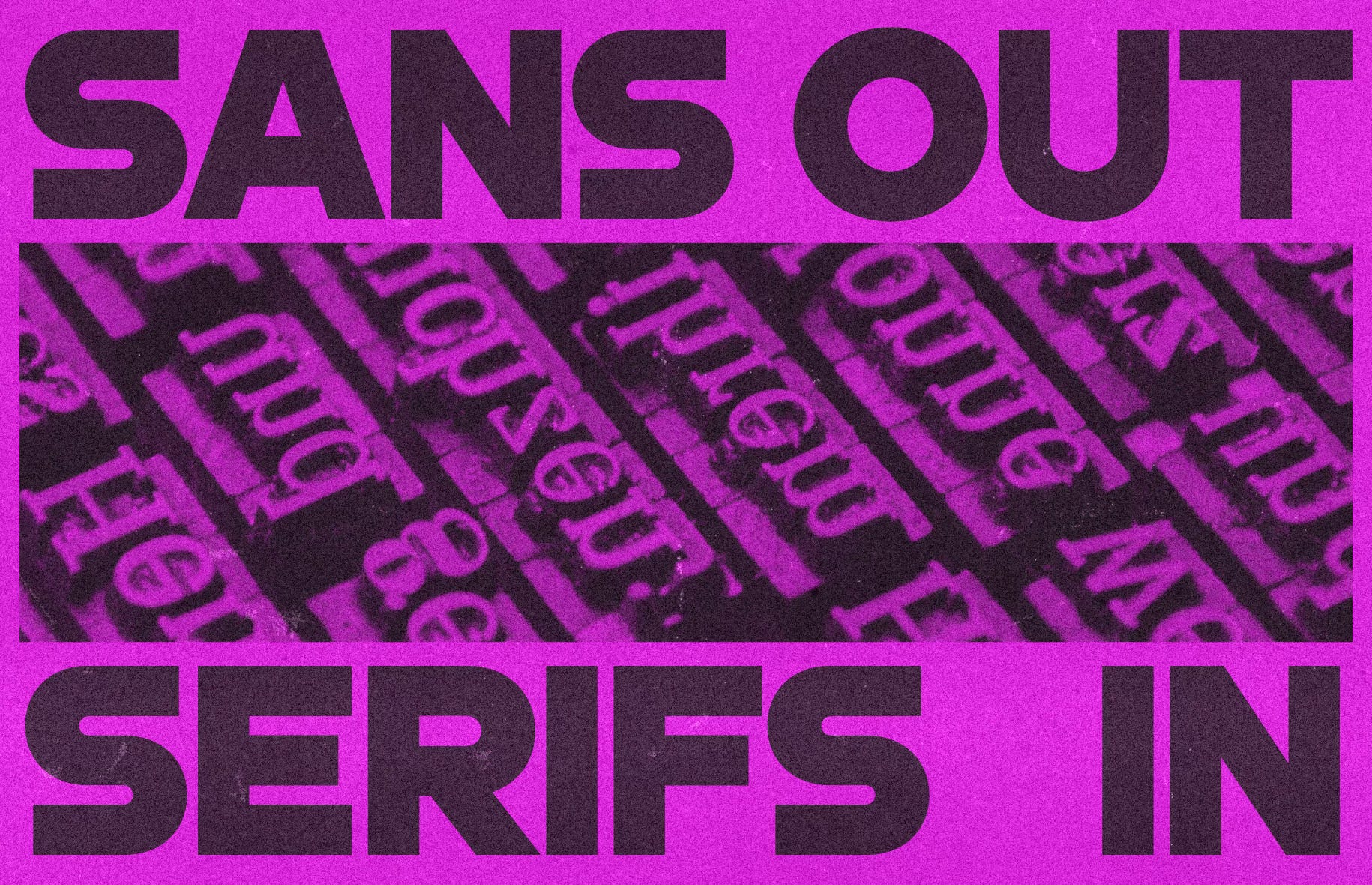
We’re kicking off with a no-brainer: Sans out, Serifs in.
Why? Well, let’s be honest—we’re all really over the endless parade of geometric and grotesque sans serifs. Over the past decade, sans serifs have been the default—so overused they’ve become background noise. With or without good reason, it felt like every brand was trying to ‘modernise’ by stripping everything down to the industrial essentials.
Tech brands, in particular, have been the worst offenders. Apparently, fashion is a close second. yikes.

But now, it seems both brands and audiences are craving something different. Every action has an equal but opposite reaction.
In a sea of sans-ness, serifs offer a way to stand out. They’ve shed their ‘old-school’ reputation, thanks to type designers continually crafting new contemporary designs, and let’s face it—nostalgia is having a major moment. Serifs feel like a natural way to add flavour, character, and individuality back into branding and design.
Here’s my case for serifs:
The very cool, the very youth brand for KATSEYE by HuskyFox. Seriously though, their branding and graphic design is amazing. I don’t know if I’d go so much to recommend the series, but lots of the excellent KATSEYE brand featured in the most recent season of Netflix’s Pop Star Academy.
Every hipster’s favourite AI chatbot, Claude and its creator, Anthropic, are also riding the Serif wave. Sure, the brand uses a mix of sans and serif, but the chatbot’s serif typeface steals the show. Paired with their warm beige palette, the serif choice subtly conveys wisdom and authority. It’s especially striking when contrasted with ChatGPT’s more sterile look and feel.
Earlier this year we saw the rebrand of South Asian culture-themed media company, The Juggernaut by Pentagram. The new brand really celebrates serifs—through its bespoke typeface designed by tttt’s favourite, Shiva Nallaperumal and Sentient by the Indian Type Foundry.
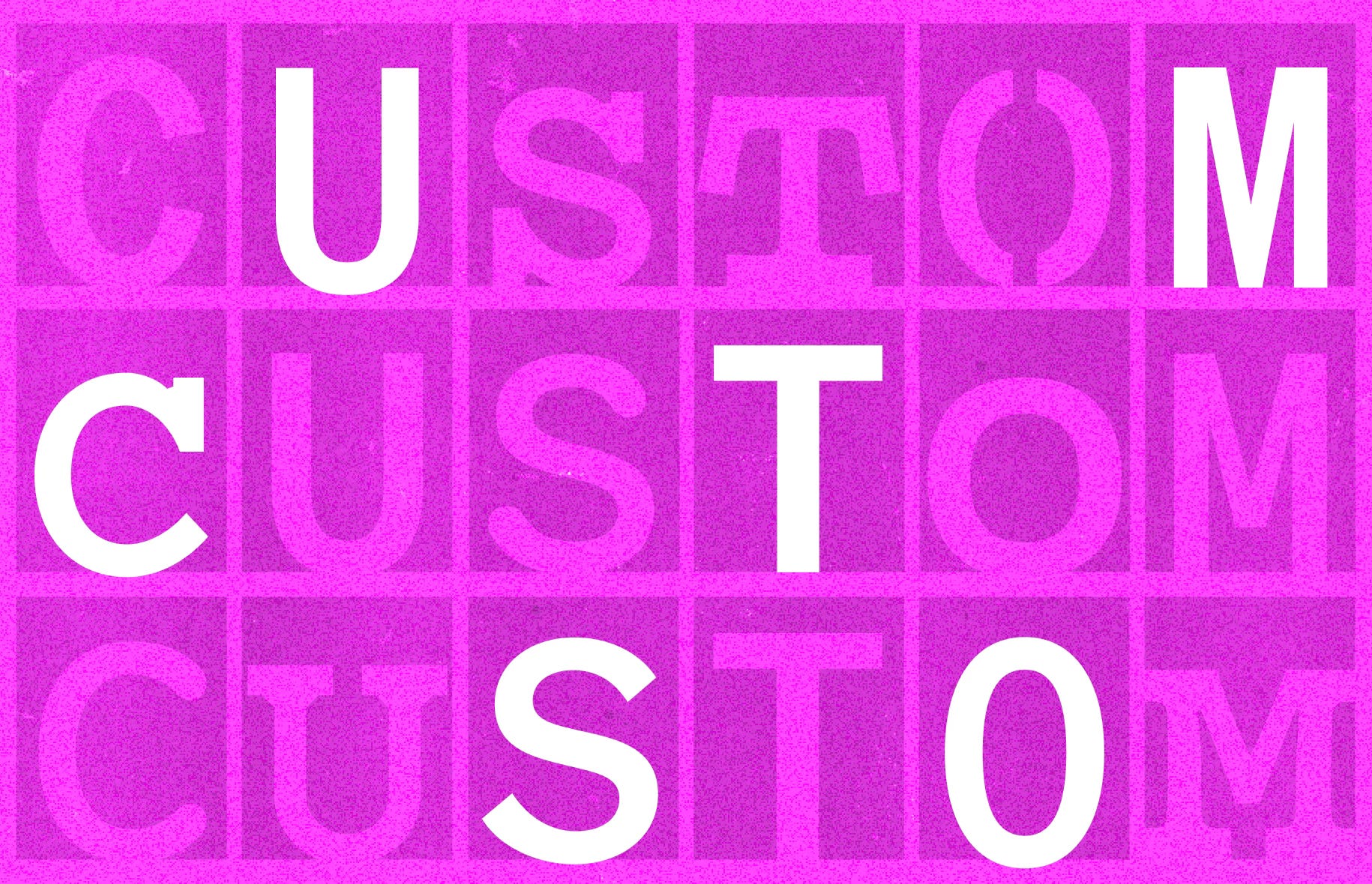
👕 One size doesn’t fit all 👚
Picture this: you’re a brand that pioneered a visual aesthetic or unique typographic style—maybe you popularised something like multiplayer cursors or a font with visible ink traps—and now everyone’s copying you. What do you do?
Enter custom typefaces.
Custom typefaces let brands carve out a distinct visual identity that’s truly their own. Forget the generic, overused fonts everyone else is recycling—here’s the ultimate way to lock down your “thing” and keep your brand’s look secure for as long as you want.
From a practical standpoint, custom typefaces are a smart long-term investment. If your brand spans across multiple platforms—think apps, web and mobile, TV, broadcast, physical spaces, and events—it quickly becomes more cost-effective to work with a foundry on a bespoke type family rather than continually paying hefty licensing fees year after year, user after user. At a certain scale, the cumulative cost of licenses can far exceed the investment in a custom font that not only provides consistency across all touchpoints but also strengthens your brand’s unique identity.
There’s been many brands recently, with custom typefaces, but here are my favourites:
Figma Sans by Grilli Type.
Figma spruced up many elements of their brand recently, but their new custom type family might just be my standout. There’s something delightfully familiar about it, yet the small details set it apart—like the tall tittles and dots, or the squared-off angle in the leg of the cap ‘R’. Big fan.Spotify Mix by Dinamo Typefaces.
Spotify’s use of Circular has arguably been one of the most boring aspects of their otherwise exuberant brand—no shade to Circular, but it’s got no sauce. So when Spotify Mix was introduced, it was a welcome remix. No really, the font is an actual remix of humanist, grotesque, and geometric forms into one flexible, super-variable family. This allows it to flex across display contexts like album covers while still performing in functional settings like long-form articles.Instagram’s in-app custom fonts by Colophon Foundry.
Fonts have always been tools, but typically within the interfaces of text editors or design software. Instagram has taken things a step further by collaborating with Colophon to design not one, not two, but six new custom fonts. These typefaces allow users to create more dynamic and personalised Instagram Stories and designs.
⏪️ The limit does not exist ⏩️
Yes, indeed, that is a Mean Girls reference.
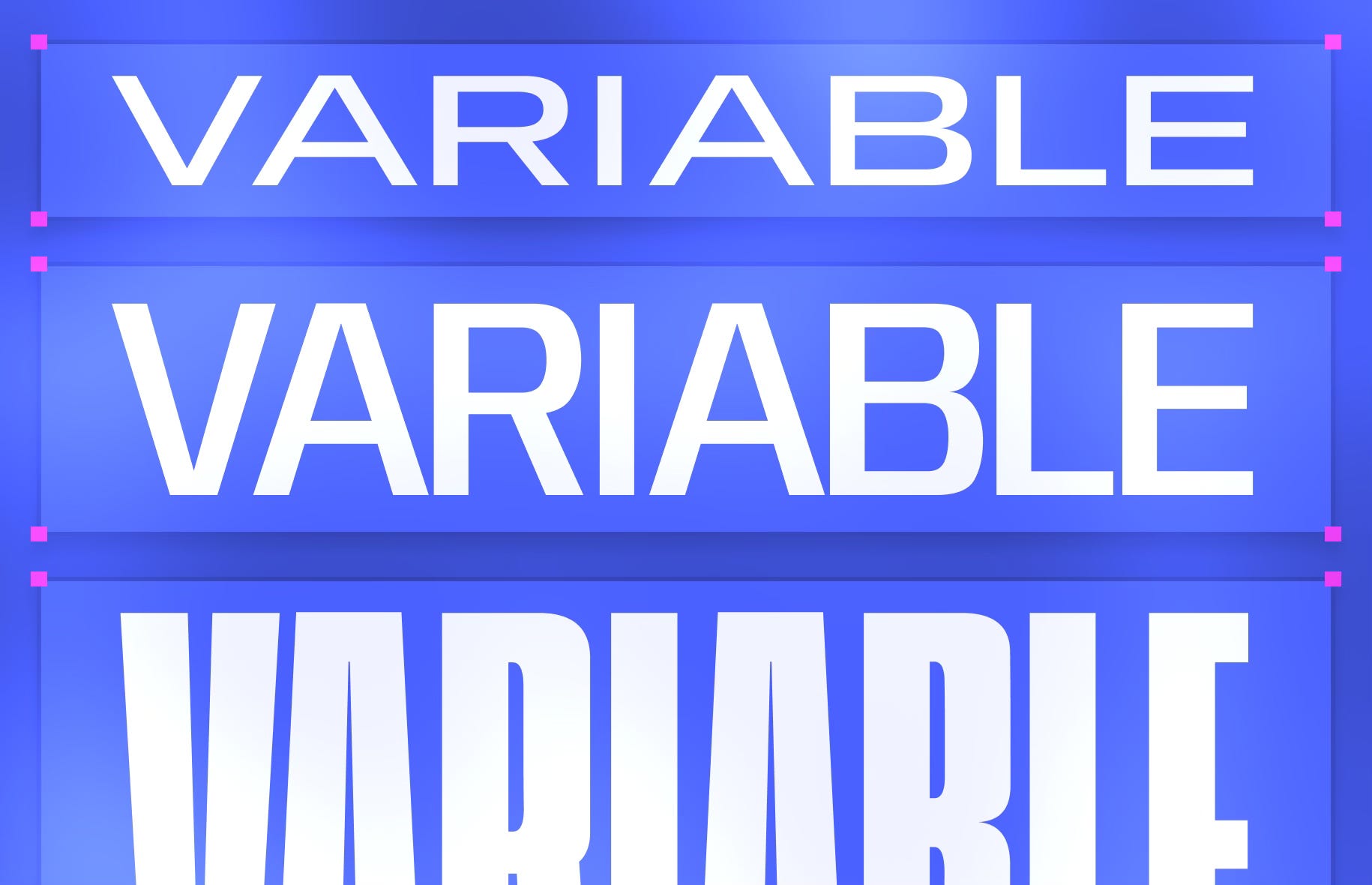
Variable fonts.
For this one, I’m not going to spend too much time explaining the what and why, ‘cos if you’re a tiptoptypetips super fan, you’ll know we’ve covered this before. If for whatever reason you haven’t read these, booooooo!
But here they are:


Variable fonts give designers the freedom to tweak weight, style, and width with precision, making it easier to inject personality into any project. Plus, they open up a whole world of possibilities in web design and animation, allowing fonts to adapt and move dynamically across different screen sizes and contexts.
Between Super Superfamilies and this edition, there’s tons of variable families we’ve discussed. Psst, most custom typefaces are variable fonts these days. So instead of recommending some more, here’s a site for finding and trying variable fonts.
Ironic to how I started, I really enjoyed curating, writing and designing this edition. I hope it was as fun to read! Please let me know if you did, and if we should make TIPTOPTYPETRENDS an ongoing series :)
Oh, and what trends have I missed? What else are you spotting? Let me know!
CYA
🌈 Sneha.
It was nice to see a new TTTT mail in my inbox! Especially when there's a trends edition :) Some trends I've personally seen are - 1. Weird sans serifs- Scrolling down the brand new blog, I've seen a lot of wordmarks that are sans serifs, but with exaggerated, weird qualities - think reverse contrast, bell bottom terminals, exaggerated or quirky designs of particular letters like e, a, g. I might connect this to the trend of falsely clumsy, hand drawn illustration, as a reaction to the rise of AI images. Brands seeking to distance themselves from the flat, bland perfection of AI images are seeking to add more imperfections in their expressions, through the hand drawn doodles and letterforms. Which can further be connected to the trend of Flash-polaroid photography - think Brat era vibes - emphasising messiness, rawness to showcase authenticity.
I'm sooo here for the maximalist, retro era as a brand designer! Loved this piece and keep writing.